How to create cool logos for your website or youtube channel – Free Tools & Video Tutorials
How to Create a Logo?
Here to learn how to make cool logos? First, it’s important to understand the complexity of this simple task. Don’t worry– I’m not going to bore you into oblivion with the history of logos. But outlining context, simplicity, and the psychology of color are pertinent.
Okay, I get it. You’d rather skip ahead to the tutorial? Over 85% of shoppers decide to purchase your product on color choice alone. Be advised this information is relevant. You never get a second chance to make a first impression. Let’s go!

What is a Logo?
A logo is a design, symbol, and/or text used by an organization. A brand that identifies themselves and their company’s products.
What are Logos Used for?
A logo’s use is the foundation of your brand. Found on everything from packaging to uniforms. They’re the way customers distinguish you from the competition.

Why are Logos Important?
Besides being the trademark of your company’s brand? A first impression lasts a lifetime. What do you want your customer’s lasting impression to be?
Advantages of logos
- Commands attention
- Identifies your company
- Foundation of your brand
- Legitimizes business
- Separates you from competitors
- Establishes brand loyalty
- Enacts professionalism
- Self-recognition
Which colors to use in my logo?
I’ll cover this in depth below. But take note of this color star which shows the most popular logo colors by industry.
What Makes a Good Logo?
Several elements are involved in the design. The top five components to making a good logo are:
Simplicity
Nike did it. Some of the most successful logos in history are– simple. Logos designed with many colors and too much information, are more difficult for customers to remember. Simplicity makes a design significant, adaptable, and unforgettable.
Relevance
Target hit it– right on the obvious bullseye with their corporate logo. Receiving instant and massive brand-name recognition.
Memorability
Mc. Donald’s iconic logo is memorable enough that they no longer need any text to identify their brand. Those golden arches achieved worldwide identification.
Uniqueness
Starbucks brand is named after the first mate in the classic novel, Moby Dick. The Evolution of the Starbucks Logo is an interesting insight into its seafaring theme.
Versatility
Sony’s PlayStation is a perfect example of versatility. Originally a multicolor monogram style logo. It’s evolved into a different format of the system’s initials with. Sony’s newest console, (PS4) incorporated a throwback to the original logo. Substituting in black and white format.
The effectiveness of a good logo often involves the meaning behind it. These companies’ concepts proved successful:
In an interview with Creative Bits, Rob Janoff, (apple logo designer) stated:
“I had the bite out of the apple put into the design to make it clear that it was an apple and not a cherry or a tomato.”
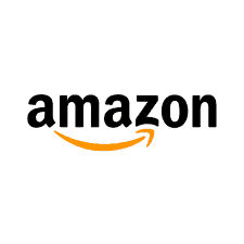
Another fantastic example of versatility. Apple’s logo has changed colors over the years. But the bite remains the same.Have you ever noticed the arrow on the Amazon logo is grinning from A-Z? There’s something more to that smile. A simple but intentional concept. Representing they sell everything from A to Z. The results? Big, yellow smiles on their customer’s faces.
Still with me? Beginning to comprehend the components involved in the process? A final, critical element requires attention before creating your logo, color scheme. But Suzi, I’m here to make cool logos? I get it. Let’s get it– together. After we explore colors influence on customers response to your logo, (business).
Logo Colors
Color’s considered the most important factor determining purchasing products. According to eighty-five-percent of shoppers!
Color Psychology in Logo Design?
Examining the way human behavior is affected by different hues of color is known as, color psychology. Emotions, train of thought, and reactions are influenced by color. It’s a key ingredient to great, and effective design. What do you want your logo to say to your customers? How do you want them to feel? And, what is your desired reaction?
Red – logo color
Red is powerful, exciting, passionate, fiery, and sometimes– dangerous. Love and romance illustrate themselves in red. Entertainment icons such as Netflix and Nintendo find red emboldening. Often used as a call for action because of the urgency the color stimulates.
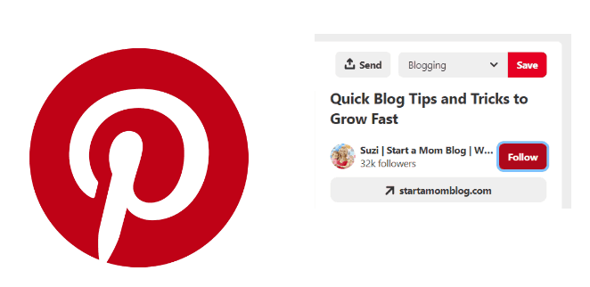
Pinterest is a prime example of red for the win. Simple, two-color logo. Notice the pin design in the letter P. Clever and intentional. Accompanied by red’s urgency to pin. Click on the red Follow button on the image above. Did you follow me? Did the color accompanied by my call to action attribute to that follow? Didn’t follow me? Awe– darn, maybe next time 🙂
Orange – logo color
Orange is enthusiastic. Representing creativity, joy, youthfulness, and adventures. It’s warm, cheerful, and friendly allure is perfect for children products. Orange also stimulates hunger. Making it optimal if in the business of food.
Yellow – logo color
Yellow warrants warmth like the sun. Optimistic, positive, and happy. Yellow highlights its surroundings. And it stands alone. Too much yellow can cause impatience and distraction.
Green – logo color
Green symbolizes life, nature, and peace. Because green is prevalent in our natural environment it’s ideal for a multitude of backgrounds. Money, wealth, and fortune are the antithesis of nature. Yet also represented by green.
Blue – logo color
Another earth color. Blue’s associated with the ocean’s freedom and eternal sky. Blue indicates harmony, tranquility, and peace. It calms and soothes. Trust and dependability become projected perceptions.
Purple – logo color
Due to its scarcity in nature, purple is regarded as wise, sacred, and noble. The color of royalty. Purple is creative, ambitious, and powerful. Use it sparingly to avoid exuding arrogance and causing frustration.

Black – logo color
Black is strong, sexy, sophisticated. A popular color in fashion design and retail. Mystery, prestige, and confidence are conveyed with black. Sadness, anger, and death are often affiliated with black. Know your audience.
Brown – logo color
Brown exhibits earth, nature, and wood. Brown warrants feelings of comfort, trust, and unity. It contrasts well with white.
White – logo color
White represents light, purity, goodness, wholesomeness, and cleanliness. These characteristics are indicative of North American culture. Using white keeps your design clean, neat, and simple.
Grey – logo color
Grey is neutral, calm, and balance. A shade between black and white, grey promotes balance. Too much grey can become dull and depressing. Discover more here.
How many colors should be in a logo?
There isn’t a law that enforces the number of colors you may have in a logo. But 95% of the top brands only use one or two colors. When deciding how many colors to include, ask yourself this– are you the rule or the exception?
How to Make Cool Logos?
I hope you were paying attention! Cool logos follow the guidelines above. A few exceptional ones break them. Do you have your design in mind? Great. Let’s get started.
How to create your own cool logo
TUTORIAL VIDEO COMING SOON
Seeking further inspiration? Scroll further to dive into cool logos for gaming, blogs, and companies. There are even some cool logos for YouTube.
Blog Logos and examples
Why do blogs need logos? Because your blog is your business. Like we discussed above — logos are the foundation of your brand.
Go here if you need inspiration for finding mommy logos.
If you haven’t yet, go here to start your blog. Then check out these mom-follows, and extremely cool logos for their blogs below:
Oh wow, I am inlove with this blog right now! Jenni has a phenomenal eye for design and can make even the most boring little corner sparkle. Her logo is simple, yet colorful, love it!
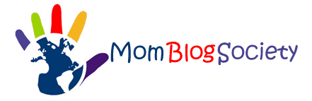
Mom Blog Society’s logo disregarded the traditional color etiquette and won. A successful network of writers, colleagues, and advisers. Striving to connect consumers and brands worldwide. Their logo is relevant to the cause.
Kayla from IvoryMix sells stock images on her blog. Her logo has a rose gold shade and glimmer, and even though it has multiple elements, the one shade of color ties it together.
Susie teaches moms how to keep their toddler and little ones busy with simple activities. I love the mix of capital and lowercase letters – very much how a toddler would learn how to write. The mix of colors also brings a joyful feeling to her logo.
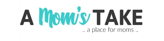
Janel’s logo for A Mom’s Take made great use of a variety of fonts. A very clean, crisp, two color appeal. Janel is a top mommy-lifestyle blogger in 2019. Her site is a great place for moms.
Her Finland
Varpu is a mom blogger who teaches her readers all about Finland and Finnish culture. Even from this small niche blog, she’s made a full-time income!
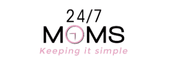
Twenty-four-seven moms keep it simple and creative. Using a clock as the letter, O. Perfect correlation to the time with this tribe of 24/7 moms. I love it.
Mom Spark is a trendy blog for moms, (award-winning and worthy of a follow). Amy’s logo is a classic simple text with a hint of a rainbow. Very eye-catching.
Cool Logos for Gaming
Multiple websites exist with gaming logo templates available for purchase. Some top contenders are:
Gaming Logo Maker begins with selecting your clan template. Once you determine the clan option you want to customize- you’re given that option. They accept six different forms of payment. Becoming available for immediate download after purchase.
Brandcrowd offers hundreds of customization options. including eSports online teams, video gaming, tournament players, and gaming clans. Select your favorites and begin customizing. An ability to try one for free is available.
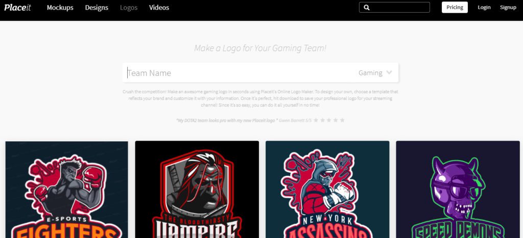
Placeit is an awesome platform for creating cool logos for gaming. There are tons of designs available for crafting into your own. A feature that sets Placeit stands apart from other gaming logos websites. Giving you the ability to stick your team name into the search field. Placeit then generates multiple templates automatically. Examples become available instantly for your perusing.
Example:
I typed in, Mommy Warriors– and within a few seconds, I had several pages worth of cool logos to choose from. (And a couple of lame ones too let’s be real). But you get the idea? Very cool with a price tag of $39.00 each, (unless you opt for an unlimited subscription of $29.00 per month).
Cool Logos for YouTube
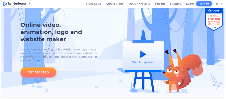
Renderforest is much more than a logo maker. But it offers a free YouTube logo in PNG. An enticing freebie. After the logo’s creation — Renderforest shows you what it looks like on business products. Including a coffee mug, journal, t-shirt, and cards.
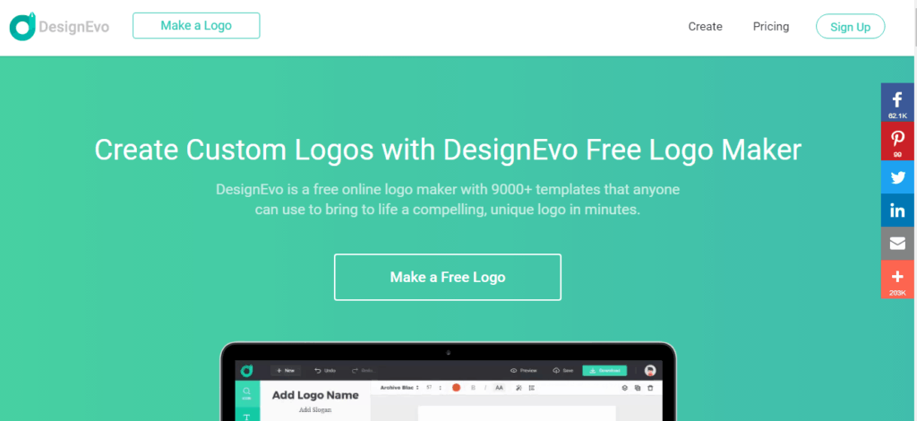
DesignEvo allows you to select from hundreds of templates, or start from scratch. While offering a free logo, there are stipulations on site regarding that freebie. For starters, you’re required to give credit.
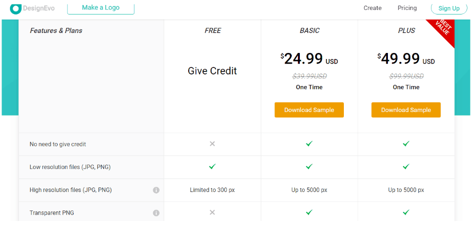
Be sure to visit the pricing guide to understand the stipulations. Also, to determine which option works best for you.
You can also use TailorBrands to create a logo for your blog.
Cool Company Logos
The ability to create cool company logos largely depends on your understanding of the context. With attention to color psychology. Let’s examine some of the most iconic company logos of all time.
Google is in the five-percent of businesses that uses more than two colors in their brand and it worked. A clean, playful font. Notice the secondary color of the L? An intentional way of advertising that Google doesn’t play by the rules.
Like Google’s brand, ebay is all lowercase and uses the same colors. Designed to be diverse, inclusive, fun, and encourage shopping.
The Pepsi globe is one of the most recognizable brands worldwide. Changing form, a handful of times over the years, (the 1940’s). Its kept the color trio– red, white, and blue.
Walmart uses two colors and a small image. The yellow flower petals of the design are actually sparks. The sparks symbolize several things. Sam Walton’s first store opening is one spark. Symbolizing all the great ideas contributing to the company’s development of the years. And the inspiration that sparks within each individual customer.
Another colorful brand. Microsoft uses four colored squares to represent their business. Blue represents windows. Red symbolizes their office suite. Green expresses the Xbox, and yellow represents the surface.
The meaning of the word, Samsung in Korean means three stars. Until 1993, there were stars as part of the logo. Since then, the brand stands alone in a trusting shade of blue. Meant to depict power.
Want to create your own cool logo?
Are you feeling inspired? Ready to create your own cool logos for gaming, YouTube, business, and more? Scroll above to my video tutorial and let’s get started. What are you waiting for?
Related Posts:
How to come up with a blog name

100% Free Blogging Course!
Get the exact plan I followed to grow my blog from $0 to over $9,000 per month in my first year.


Creating a logo in today’s era is so easy and flexible, now everyone from small startups to big brands can make their own logos with the help of AI based logo maker tools, who can generate your logo & gives you thousands of concepts according to your logo category. I have created several gaming logos for my gaming group & have created several sites, that’s why i often need a logos, I tried Design Iconic which is AI based logo maker tool.
[…] colors, fonts, and graphics you use throughout your logos and […]
[…] Platforms like Fiverr exist for selling your custom graphics and logo designs. Learn how to create cool logos and get one step closer to making those dollar-dollar bills ya’ll. I can’t pull that off, can […]